Spreadsheets;
creating a graph
Earlier we discussed the way tables can be created using Excel. As a demonstration and as an exercise create a table of cos(x) and sin(x) vs. x for values of x ranging from 0 radians to 2.5 radians. The values of x will be incremented by 0.25 radians and we would like to have a title for our table and identifying labels for the columns. Here is our version of this table ( yours may be a bit different).

Note the way we entered the library function sin(x) by looking at the content box for cell D6. Also note the following:
1) The title is entered in cell B2 but it extends over cells B2 and C2. If however we entered something in the cell C2 then the title would be cut.
2) We can adjust the width of the columns and the depth of the rows by positioning our cursor to the line at the gray areas, which contains the letter name of columns or the number name of rows. The cursor changes to a thick lined cross with double arrowed horizontal line . Click and drug the mouse under the desired positioning is achieved.
3) If several columns ( rows) are selected and the width of one is changed, then all of them change width simultaneously.
Try all of the above on your own. Remember to activate a spreadsheet while you
are reading these files.
Now we are interested in obtaining a chart which depicts the functions cos(x) and sin(x) versus x. There are some quick ways of doing this but we will demonstrate the full method using the chart wizard of excel.
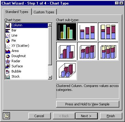
Click on the chart icon or equivalently select Chart from the Insert menu. The wizard should appear as shown below:
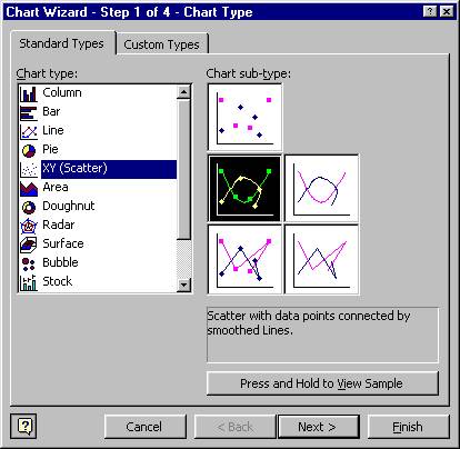
Select the chart type XY(Scatter) and then select the smooth lines with markers as shown in the picture below.
Click on Next and the following picture will appear:
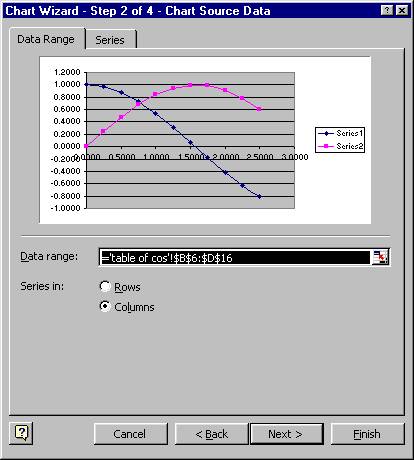
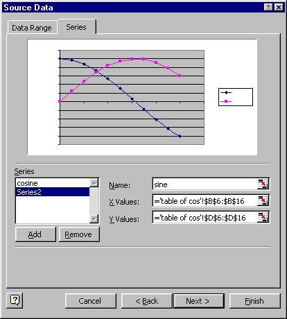
Notice that the wizard picked up the numbers and presents some graphs that it thinks we want charted. In this case the default choice is correct however we can explicitly specify the data and the series. Click on the Series button and you will see that you can define each series(each individual graph on the chart) by assigning its name, the range of x values and the range of y values. In order to specify the range of values for a variable, you can click on the chart image shown at the very right of the appropriate white box and then select a range from your spreadsheet using your mouse and then hitting the enter key. The picture below shows this part of the wizard with the function names that we entered in the name box of the series.
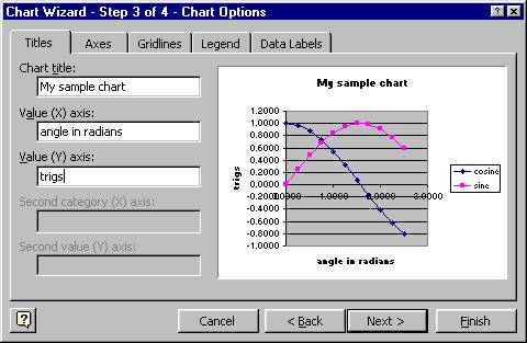
Of course you can add more series or you can delete a particular series from your list of graphs to be charted. Now hit Next and a new step of the wizard will appear. We enter the title for the chart, and the names of the x axis and y axis. Here is what we have:
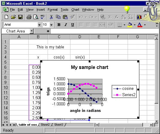
Examine the other Options, like Gridlines( can you get rid of them?), Legend position etc. Then click Next, from the 4th wizard step select placing the chart as object on the sheet "table of cos" and hit Finish. This is what we get floating on our sheet:
We can do the following with the floating chart:
a) We can move it and position it at a convenient place on our sheet.
b) We can change the size of the chart. Select it and then size it by dragging a corner or a side.
c) We can change the size, color, format, and location of any of the items on the chart such as titles, series, legends etc.
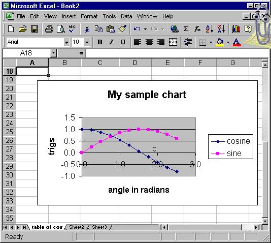
As an example we would like to change the format of the numbers on the axes so that they use only one decimal. Here is how we do it: The figure below shows a slightly enlarged chart which we moved lower in our sheet. You can see that we selected the x axis from the chart ( note the two small squares at the two ends of the x line )
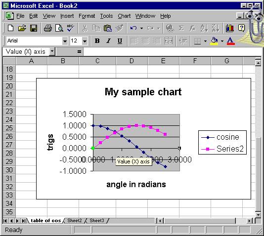
Now we click Selected Axis from the Format menu and this is what we get:
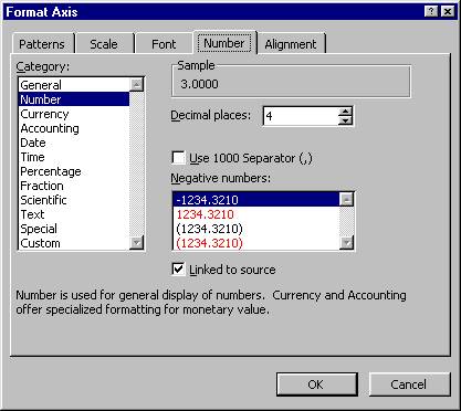
Note that we can change many things about the axis. Here we will only change the decimal places down to 1. We do the same thing with the y axis and thus the resulting chart is:
We suggest that you try several changes on the chart and on its
components. Try to change the colors, marker sizes, fonts, background of the
graph etc.
Have a good and enjoyable practice