|
Plots
|
As you read
this material we strongly recommend that you activate your MATLAB window
and try the commands right there and then
In MATLAB we can plot graphs representing the numbers we generated very simply. This is an important advantage since in MATLAB (unlike the situation in excel) we can run full programs very much like we did in C++.
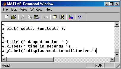
We consider the following example: We like to plot the function e –x cos ( px ) , vs. x as x varies between 0 and 4. We must first generate two arrays that hold these values ( say xdata and functdata )and then enter the command:
plot( xdata, functdata);
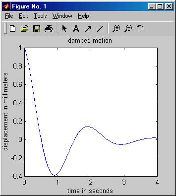
This is shown in the following picture together with the graph picture that pops up when the plot command is entered ( we choose a step of 0.1 ).
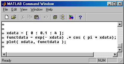
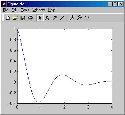
Note that the multiplication of the arrays is done by the element by element operator .* , and that the default graph generated has minimal detail on it. We can enhance the graph by using several specifications after the plot command. For example the commands
title (‘ damped motion ‘ )
xlabel ( ‘ time in seconds’ )
ylabel ( ‘ displacement in millimeters ’ )
will add title and axes labels to our graph as it is illustrated in the pictures below:
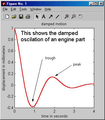
Also, by selecting one of the tools in the figure window we can enter text ( click on A ) and arrows and we can change the type and color of lines etc. Example of this is shown below
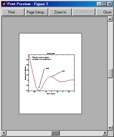
From the file menu we can choose to save or print the graph as well as to preview the print and other things. Explore them if you please. The preview command for our graph will produce the following picture, indicating that the print command prints only the graph itself.:
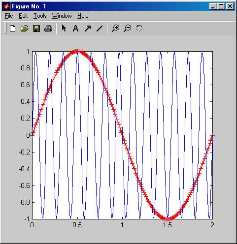
Many plots on the same figure:
In many cases we are interested in obtaining the graph of several functions on the same figure. For example we may want to compare the function sin(pi * x) to that of sin( 13 * pi * x) as x goes from 0 to 2. We can achieve this with the command
hold on;
placed after the first plot command. This is illustrated in the following picture together with the resulting figure:
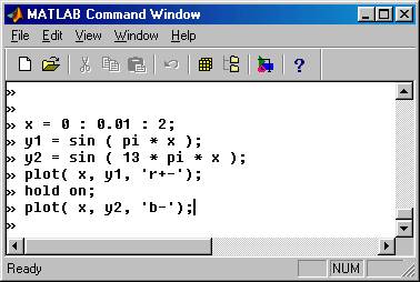
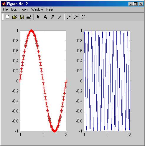
In the plot statements the condition string ‘r+-‘ signifies that the line should be drawn as red + signs connected by solid lines, while the string ‘b-‘ signifies that the line is blue and solid.
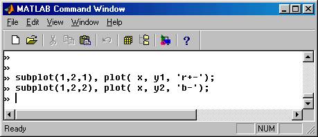
Many windows on the same figure:
Sometimes we may want to have several graphs grouped together on the same figure but with independent axes. We can achieve this with the command
subplot ( m, n, k )
placed before the plot command. The integers m and n describe the number of windows in the vertical and horizontal direction. We can have 2 X 1 or 1 X 2 or 2 X 2 . The third integer describes the location, which is numbered in the way shown below:
|
1 |
2 |
|
3 |
4 |
The following example illustrates this. The resulting graph is also shown: