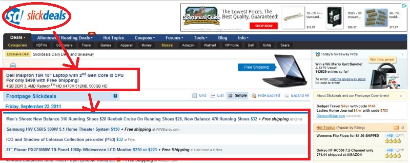
Website Evaluation - Slickdeals -Functionality
Instantly understand what the site is about?
The site's purpose is not immediately apparent since there is a lot of activity and one might assume that the purpose of the site is shopping instead of searching for places to shop.
Understand what you can do there?
The "Deals" frontpage makes it clear that there are deals to be had but how one manages to achieve that goal is not immediately clear since the user has to click through the various topics to understand the entire process.
"Look & feel" entice you to stay and explore?
The "look and feel" does not immediately entice users to explore since there are a lot of items and discussion topics that might not interest everyone and the "lingo" can intimidate or confuse users.
Functions most often used easily accessible? Easy to use?
The main functions are accessible from the navigation bar and the search toolbar. This allows the user to quickly navigate to what they want to find. However, this assumes the user understands how the site works.
Links clear about where they will take you?
The links are not immediately clear because this assumes that the user knows all the purposes of the parts of the website. For example there is a "Blog" but the purpose of the blog is not always clear and the user may not know WHY they want to go there.
Instant visual hierarchy? Or visually too busy?
There is not an immediate visual hierarchy and the page is broken up by the advertisements. Although the eye is drawn to the site's logo, the large advertisement breaks up the flow from the logo to the main topics of discussion and important updates.

Text easy to read?
The text is easy to read because a very basic font is used in a dark color with a light colored background. Shades of background colors help create a grid effect to differentiate between different discussion topics.
Graphics easy to understand?
There is actually a lack of graphics on the site and most of the discussion is described via text. There is an option to enable graphics but this is not immediately clear. The problem with textual description in this case is that the "lingo" often pervades the text.
Large site has a site map, index or search function?
As mentioned before, there is a search toolbar and an advanced search popup feature.
Help available and useful?
Yes.
Download times reasonable?
Yes.